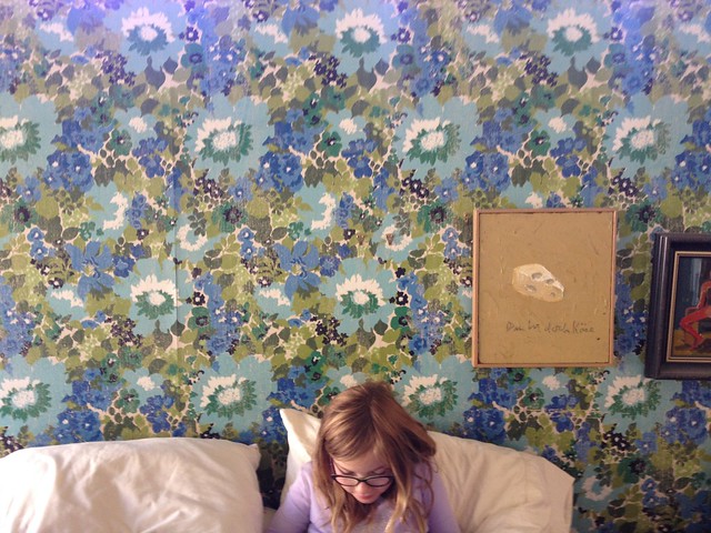
it is, of course, older than that. and when we bought the house, was hidden behind another layer of even less lovable paper. we actually get a lot of compliments on this floral - and of course it is in keeping with our house and its mcm vibe. i however, am so very done with it. and i look forward to our bedroom remodel as the opportunity to change it up. (more on what's happening in our bedroom - on the decorating front! - soon...)
so here is the short-list. and it has been a long time coming. in the end, we decided we wanted something that kept the spirit of the old paper, but that made the room feel fresh. we also wanted it to match-up with walnut furniture and the quilt we have, and relate to the adjoining bathroom color-scheme. the samples are all from MissPrint out of the UK. (we looked at a lot of options, and i was sorry we couldn't find something more local. lots of great stuff out there - but either the design, or the color way, just weren't quite right.)
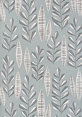
garden city :: glacier
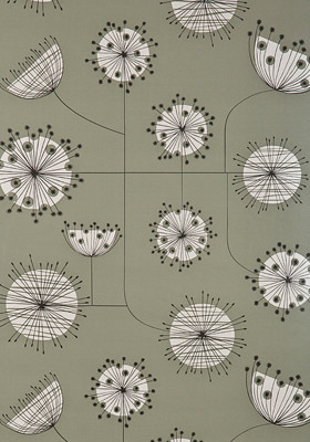
dandelion mobile :: french grey and white
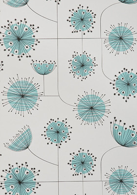
dandelion mobile :: porcelain with powder blue
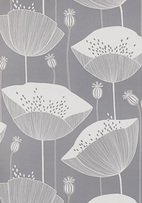
poppy :: thunder
i know which one is my favorite - but am curious, which is yours?
5 comments:
I am drawn to
dandelion mobile :: porcelain with powder blue
I think it is the pop of a non neutral color.
Thunder, love thunder....
i vote poppy :: thunder. how big are those blooms?
they are all gorgeous. number 1 for me is likely dandelion - french grey (love that warm grey and the linear feel), with poppy: thunder a close second.
Poppy thunder! And the Dandelion in French grey second. But it may also depend on the scale - hard to tell how big are the flowers in the poppy one? I get a sense the dandelion might be slightly smaller scale? All are really lovely! I am wanting a bit of Josef Frank in our dining room, someday!
Post a Comment